Question ✚
How can the Beauty Lab app effectively cater to the evolving needs of environmentally conscious consumers while maintaining a seamless user experience and visually compelling design?
Solution 🧪
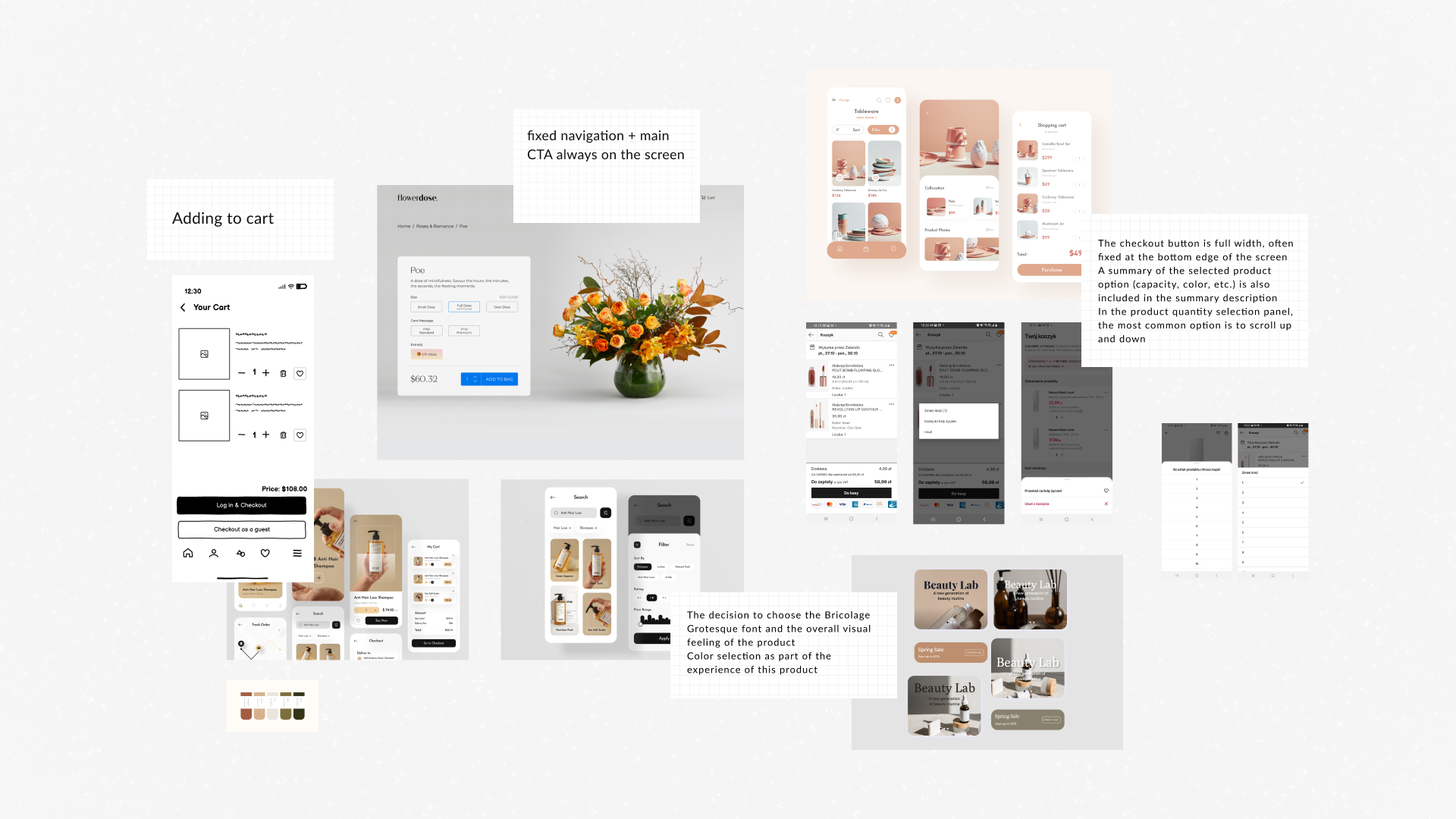
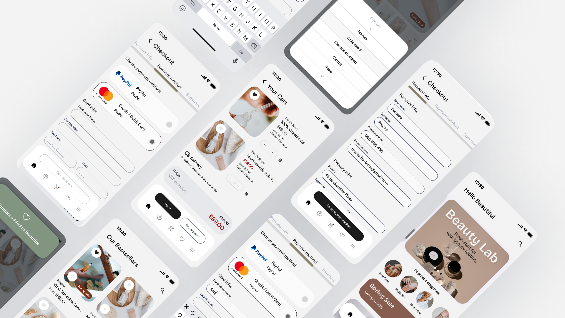
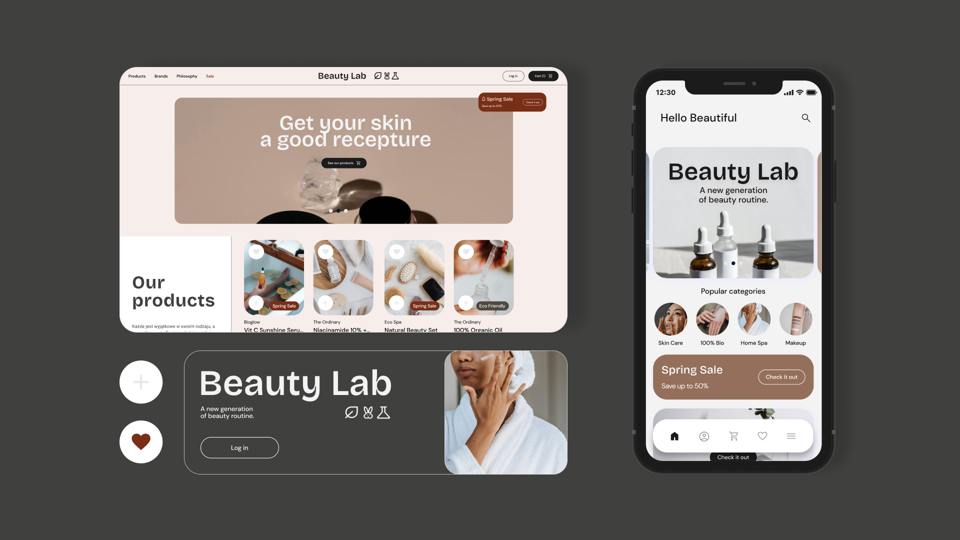
In the checkout process, I have implemented a streamlined and transparent system, minimizing steps to reduce friction and encouraging swift transactions. Clear progress indicators and messaging guide users through the checkout journey. Eco-themed labels and icons accompany each item, providing users with instant recognition of sustainable choices. A refined categorization system ensures easy navigation, allowing customers to discover and explore ecological cosmetics effortlessly. By optimizing the customer flow, we aim to strike a balance between presenting a diverse product range and maintaining an uncluttered, user-friendly interface.
Context 🔍
The development of the app was driven by a deep-seated commitment to fostering sustainability and conscious consumerism in the realm of cosmetics. Contextually, our project aimed to provide a dedicated platform for eco-friendly beauty products, catering to a growing market of environmentally conscious consumers.
Problem 🔬
How can we strike the right balance between showcasing ecological cosmetics in a visually compelling manner and ensuring an intuitive user experience? Integrating sustainable design elements, such as eco-conscious color schemes and imagery, while optimizing navigation for easy product discovery, poses a unique challenge. Additionally, crafting a checkout process that reflects both efficiency and environmental mindfulness requires thoughtful consideration.
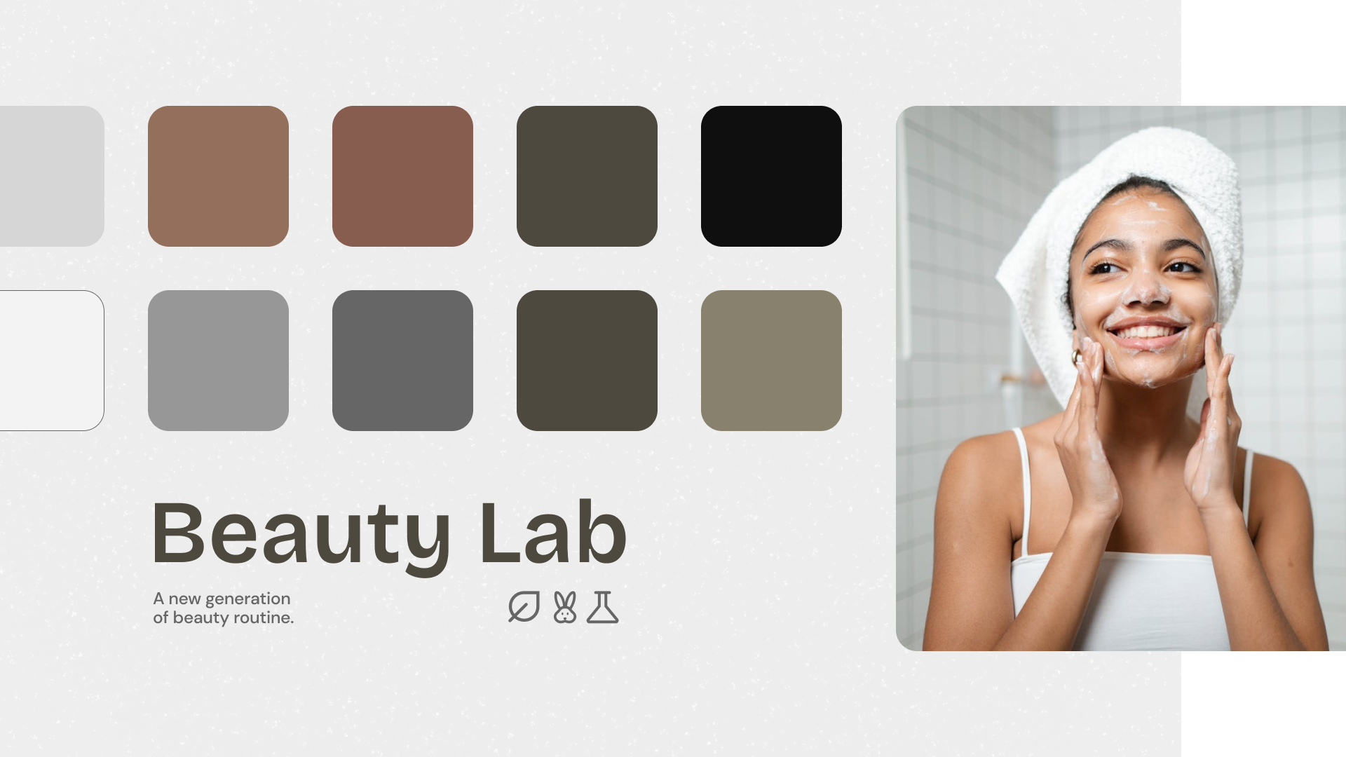
In the visual language of Beauty Lab, the use of linear iconography ensures a clean and modern aesthetic, reflecting precision and attention to detail. Earthy colors, inspired by nature's palette, infuse a sense of organic beauty into every aspect of the brand. The choice of rounded edges contributes to a softer and more inviting visual experience, creating an atmosphere of comfort and approachability.